Nancy Fernandez
Nancy Fernandez is the talent behind Apostrophe Solution, which provides customized coaching services for young adults and professionals. She offers executive function coaching, literacy intervention, college essay support, and corporate support. Her work is all about helping clients identify and remove barriers to success, optimize workflows, and cultivate a sustainable balance between achievement, rest, and fulfillment. And it’s not just about the end result—for Nancy, it’s about doing this work in a shame-free, guilt-free space with a heart-centered approach.
And I am here for it.
Nancy came to me because her website needed a total overhaul. It was a DIY job that needed to be brought up to modern design and accessibility standards—and it needed to do a much better job of centering her talent and spotlighting her new book.
You know I love working with sharp, talented woman business owners to give them the platform and spotlight they deserve. Read on to see how it came together!
Kind words
“I was fortunate to have my new website created by Kristen. During our time together, I had to deal with some family emergencies and she was so patient and kind with me. Once I gave her the content, she built a professional, clean, and vibrant website in no time at all! I highly recommend working with Kristen, and I am absolutely grateful to her creativity, knowledge and expertise.”
Nancy Fernandez, Owner
Apostrophe Solution
The old website
Nancy’s original website was built on Squarespace, the platform I love to work on. But it had been built on Squarespace 7, a version of the builder that offered lots of options but was notoriously difficult to work with.
Even so, Nancy made it work! She built herself a multi-page site that got everything out there for prospective clients. Glorious!
Problem was, the design wasn’t on-brand. Text alternated between headings and paragraphs, making it hard for people and search engines alike to understand the site and her offerings. Text was layered over busy photos in some places, making it all but impossible to read. The color palette didn’t meet Google’s standards for contrast and readability. Calls to action were difficult to spot.
Perhaps worst of all, the wording hadn’t been optimized for search engines. Pages didn’t contain enough context, proper structure, or the right keywords. As a result, Nancy wasn’t coming up in search results—and that meant her talent was invisible to people looking for a skilled coach.
Here’s a look at where we started:
The web design process
I was really excited to build Nancy’s new website on the latest version of Squarespace. Not only would it give her a fully updated, modern back-end experience, it would give her access to all sorts of new and nifty toys that she could use to zhuzh up her site. We’re talking animations, section dividers, upgraded contact forms, a better e-commerce experience, and more. Soooo much more.
The great part? Nancy already had a vibrant, colorful logo and color palette. She knew what fonts she liked and which she didn’t. She had a good handle on the wording. Best of all, she was ready to start selling her new book! She was ready to go with printed copies, a digital version, and all the bells-and-whistles she needed to start selling online.
Gold.
Reworking the written content was a huge opportunity for Nancy. She knew what she wanted to say and how she wanted to say it. But she wasn’t sure how to do it in a way that would give Google what it wanted while still being approachable for her clients. To help her out, I created a wording outline so she could fill in headings, paragraphs, and button text. Then, I went over it with a fine-toothed comb to make sure it would give Google the right cues.
Nancy had a few photos of herself, which looked fabulous. To help her round out the site, I gave her a list of websites where she could download some free, high-quality stock photos.
Once we had all of the content in place, it was time to start design!
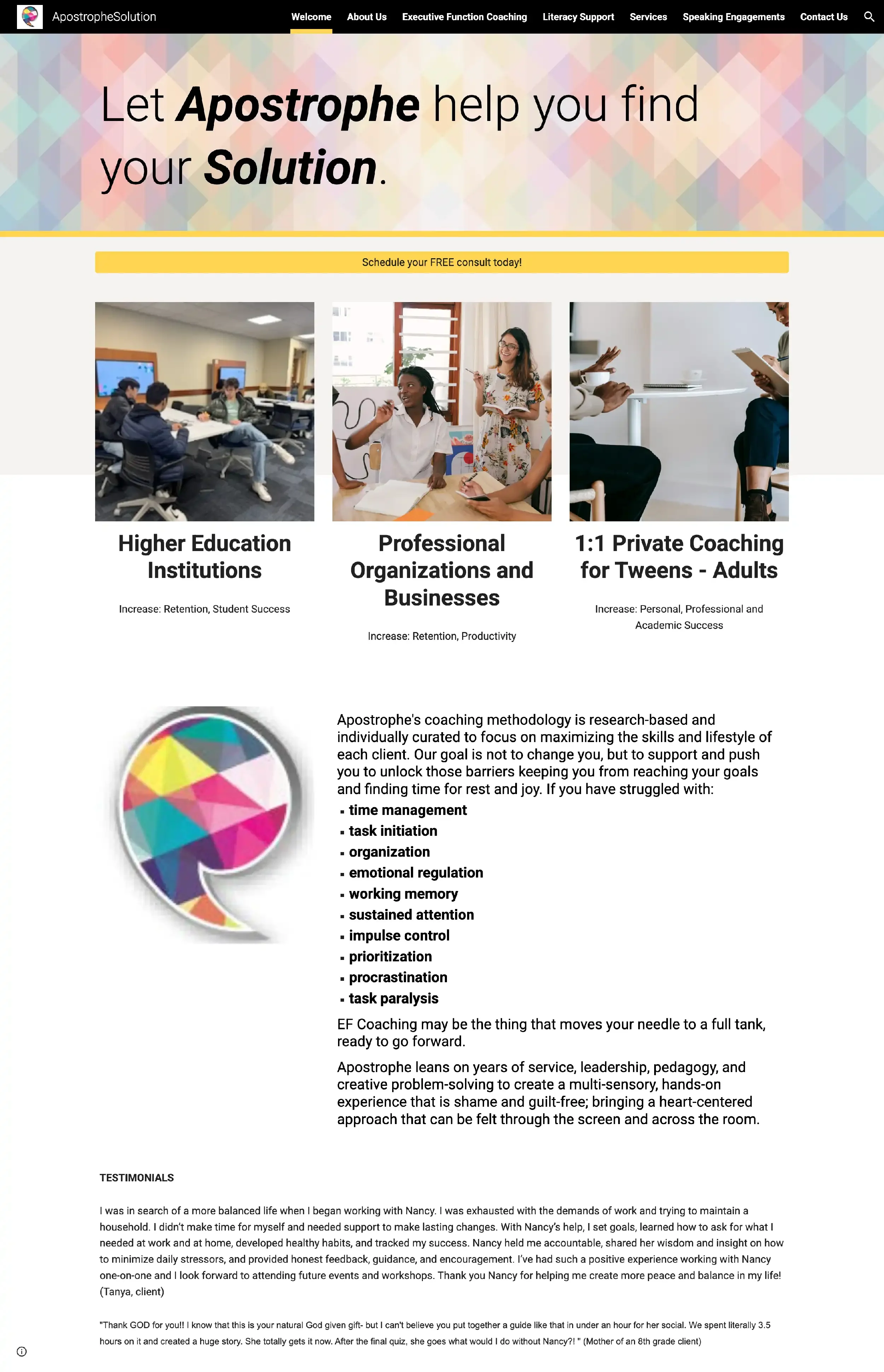
Some of Nancy’s prospective clients suffer from executive dysfunction and have a difficult time making decisions. I wanted to make her site as simple as possible for people to navigate. Think stuff like larger, descriptive calls-to-action and clear labels so people could more easily self-filter.
But I also wanted to make her site as simple as possible for people to read. Font selections play a really big role in web design, and a lot of people underestimate them. I decided to design her site with just one font for headings, paragraphs, and buttons. And for that, I chose Roboto! It’s one of my favorite fonts when I need an ultra-readable, approachable design.
Nancy’s logo includes a fabulously colorful apostrophe icon that feels warm and energetic. I pulled it out of her logo and used it as a standalone element throughout her site, along with some geometric background patterns that looked fabulous behind a dark color wash.
From there, the rest of the design fell into place. I paired her brand teal with a bright white and an off-black, then added a light grey for contrast. In several places, I used the warmest yellow from her logo as an accent color to make certain phrases stand out. I paired a few full-bleed background photos with a dramatic color wash to keep the site interesting and dynamic.
And you know I couldn’t resist the opportunity to zhuzh things up with some custom code. I love me some hover effects, especially on the buttons :)
Take a look at Nancy’s new website home page!