Picasso’s Pizza
Picasso’s Pizza is the OG Buffalo pizza joint. Since 1980, they’ve been throwing dough and serving iconic Buffalo-style pizza—you know, the real deal cup-and-char that you can only get here in the 716. They’ve got deep roots in Buffalo and Western New York, and hometown pride is baked into everything they serve.
So when Marc DiGiore, their Chief Marketing Officer, popped into my email inbox to see if I could work with them on a new website ahead of a new promo they’re doing with some Buffalo Bills players this season, I got all excited. Um, yes?!?! I love giving local businesses the website they deserve!
Kind Words
“Outstanding experience. Would highly recommend. Organized, timely, and creative. A triple threat! Looking forward to our next project together!”
Marc DiGiore, Chief Marketing Officer
Picasso’s Pizza
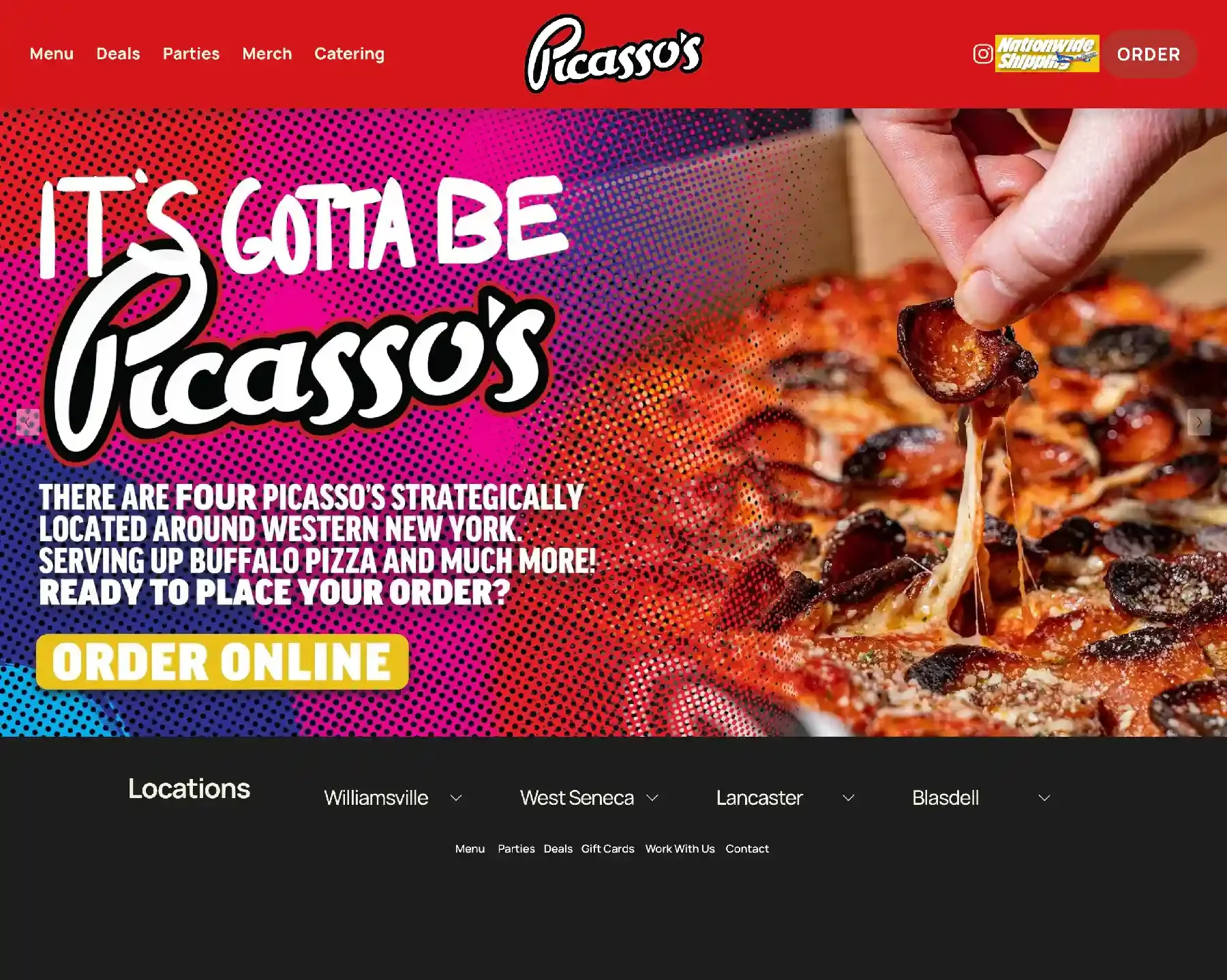
Their old website
Picasso’s used Squarespace to create their original website. But not gonna lie: It was kinda hard on the eyes. They’d leaned a little too far into the bright red that’s central to the Picasso’s brand, taking the focus off the pizza.
Over 80% of their website traffic came from mobile devices, but the mobile version of the site wasn’t looking its best. Worst of all, the tabs at the top had gotten a little too big for their britches, cluttering things up and making it difficult for visitors to order online.
To give you an idea of where we started, here’s a look at a couple of pages on their original website: The Home page and the Order page.
The web design process
When I tell you that Picasso’s had an embarrassment of riches? Believe it. Marc hooked me up with Zach Pape, their Creative Director, who proceeded to load our project folder with all sorts of goodies—including high-res logo files, font selections, a bold color palette, and some fabulous brand photography from the talented Bridget Schaefer.
To round it all out, Marc rewrote the website from top-to-bottom, filling out the wording outline I created in short order.
Do I love it when clients give me lots of awesome toys to play with? Why yes. Yes, I do.
Marc and Zach wanted a bold site with a minimalist aesthetic and I had a blast creating it!
I wanted the pizza to speak for itself, so I leaned into their brand’s dark charcoal grey and used it as the primary color throughout the site. I used a gradient that matches their new pizza boxes as the hero background on both desktop and mobile. Then, I used their brand red as an accent color for text treatments and some fun inset box shadows. To top it all off, I sprinkled in some fun site dividers and subtle animations. And for extra oomph, I popped in some custom code to create a bold button hover effect.
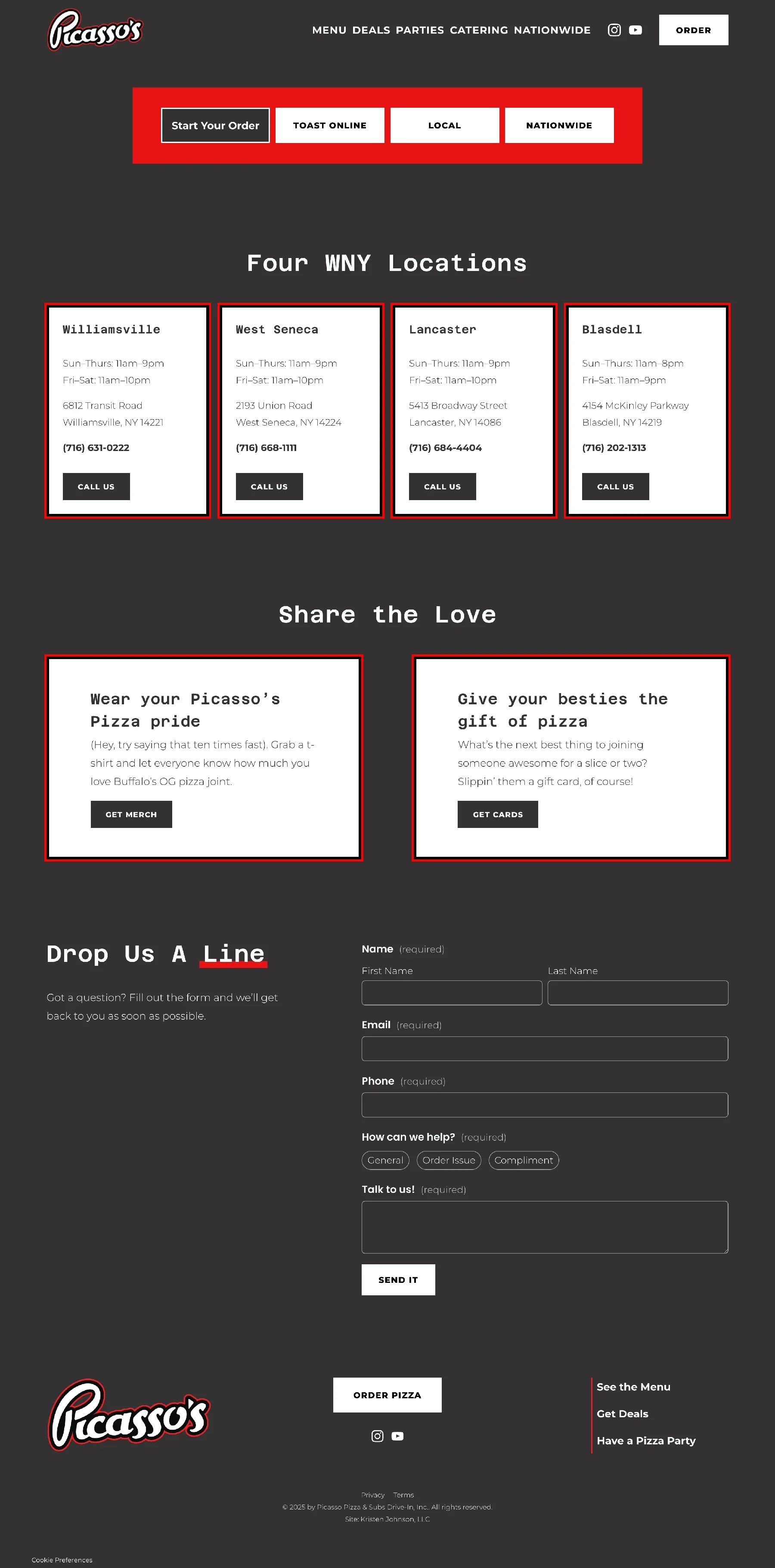
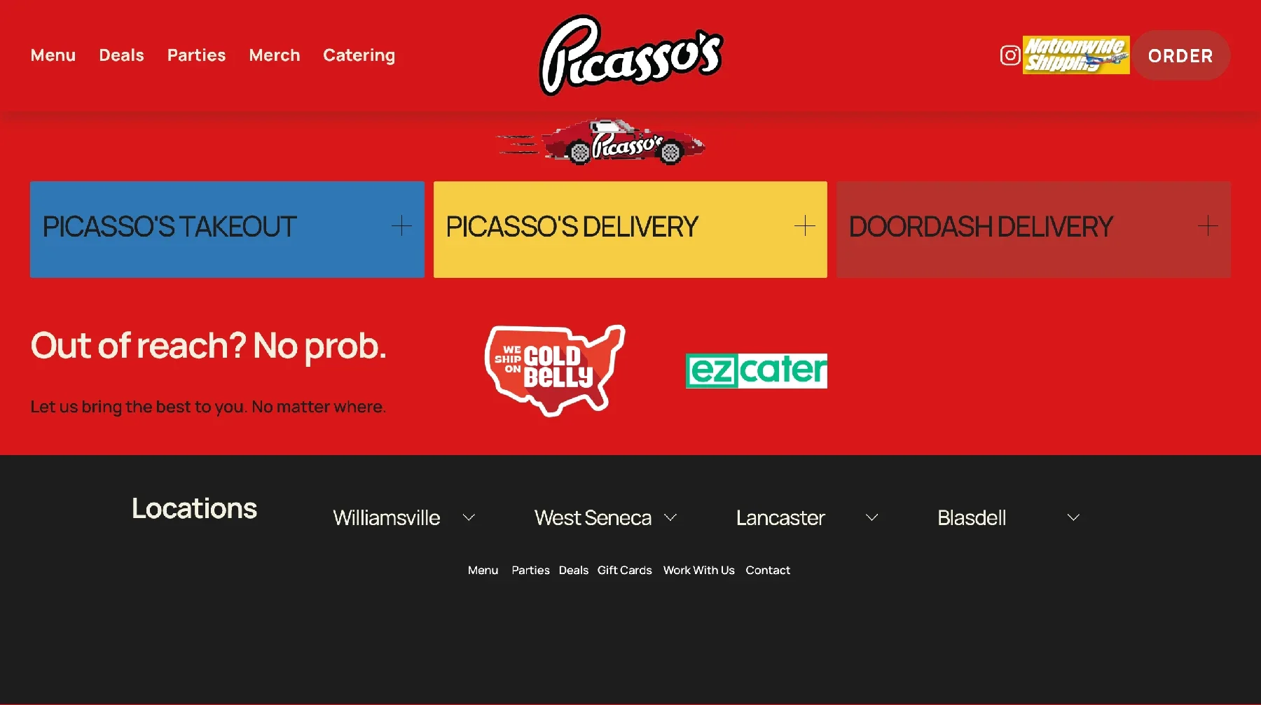
To solve one of their old site’s biggest problems, I created a prominent, bright red Order toolbar with bold buttons. Now, visitors can easily order online for delivery, local pickup, or even nationwide with just a couple of taps. Sweet.
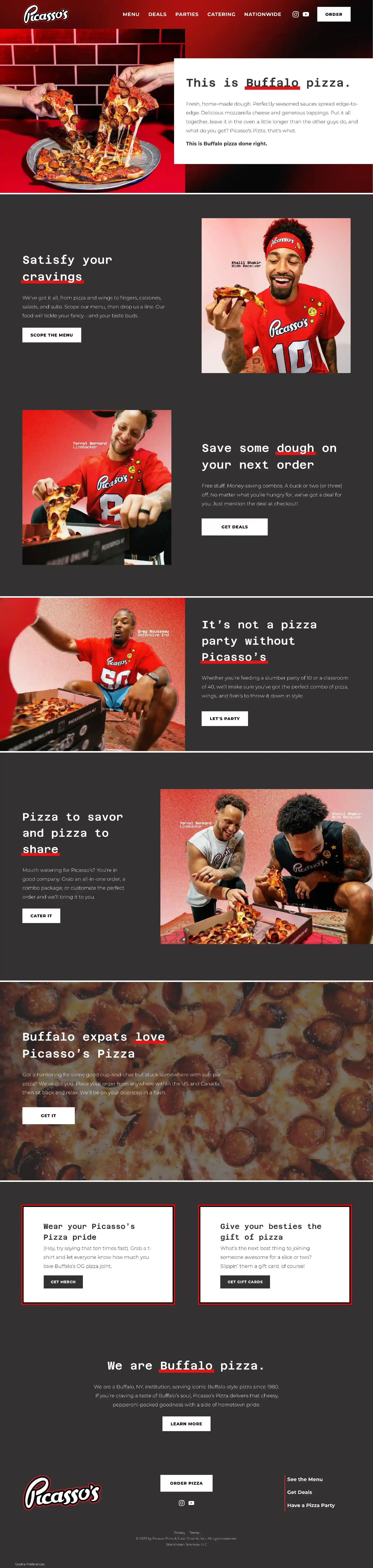
Take a look at Picasso’s new website home page and online order page!