The Veterans One-Stop Center
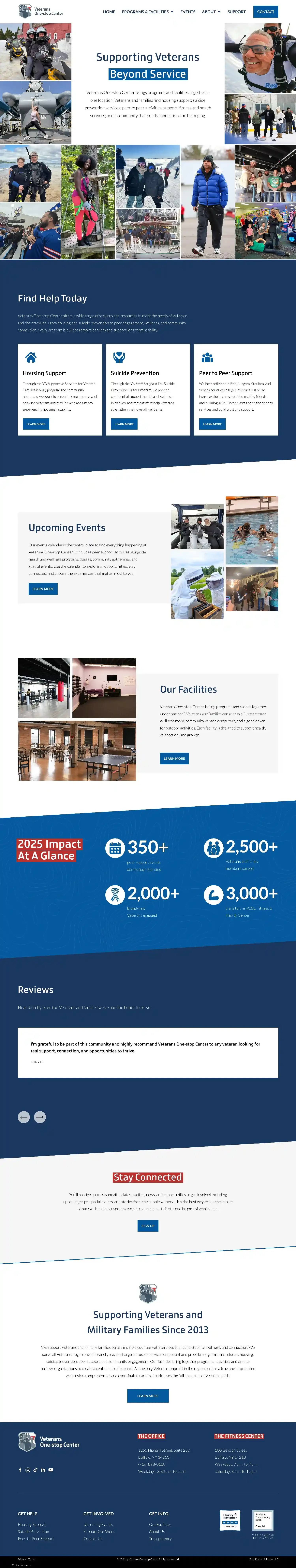
The Veterans One-stop Center brings programs and facilities together in one location. From their location on Niagara Street just outside downtown Buffalo, they provide Veterans and their families with housing support; suicide prevention services; peer to peer activities; support, fitness and health services; and a community that builds connection and belonging.
And it works. In 2025, the VOSC held more than 350 peer support events across four counties. They served more than 2,500 Veterans and family members and engaged more than 2,000 new Veterans. And over the course of a year, they logged more than 3,000 visits to their Fitness and Health Center.
When President and CEO Adam Howard and Vice President Heidi Phillips came to me late last year, it was because their current site had become a little… long in the tooth. They were ready for a refresh into something more modern and approachable.
Could I help them? Hell yes I could.
This website project was near and dear to my heart. Members of my family have served in every branch of the U.S. Armed Forces. Those who didn’t serve found other ways to give back—my favorite example is the 200+ lap quilts that my mother hand-made for veterans she met at the VA Hospital in the years before my dad, a U.S. Army Green Beret in Vietnam, passed.
What a labor of love. Read on to see how it all came together!
Kind words
“Kristen is detail-oriented and always keeps your organization or business goals in mind—not just the website itself. She’s constantly thinking ahead about your workload and helping you set things up now, so everything stays easy and organized in the future. Plus, she has a fun and approachable personality and was truly a pleasure to work with!”
Halie Cardon, Content and Engagement Specialist
Veterans One-Stop Center
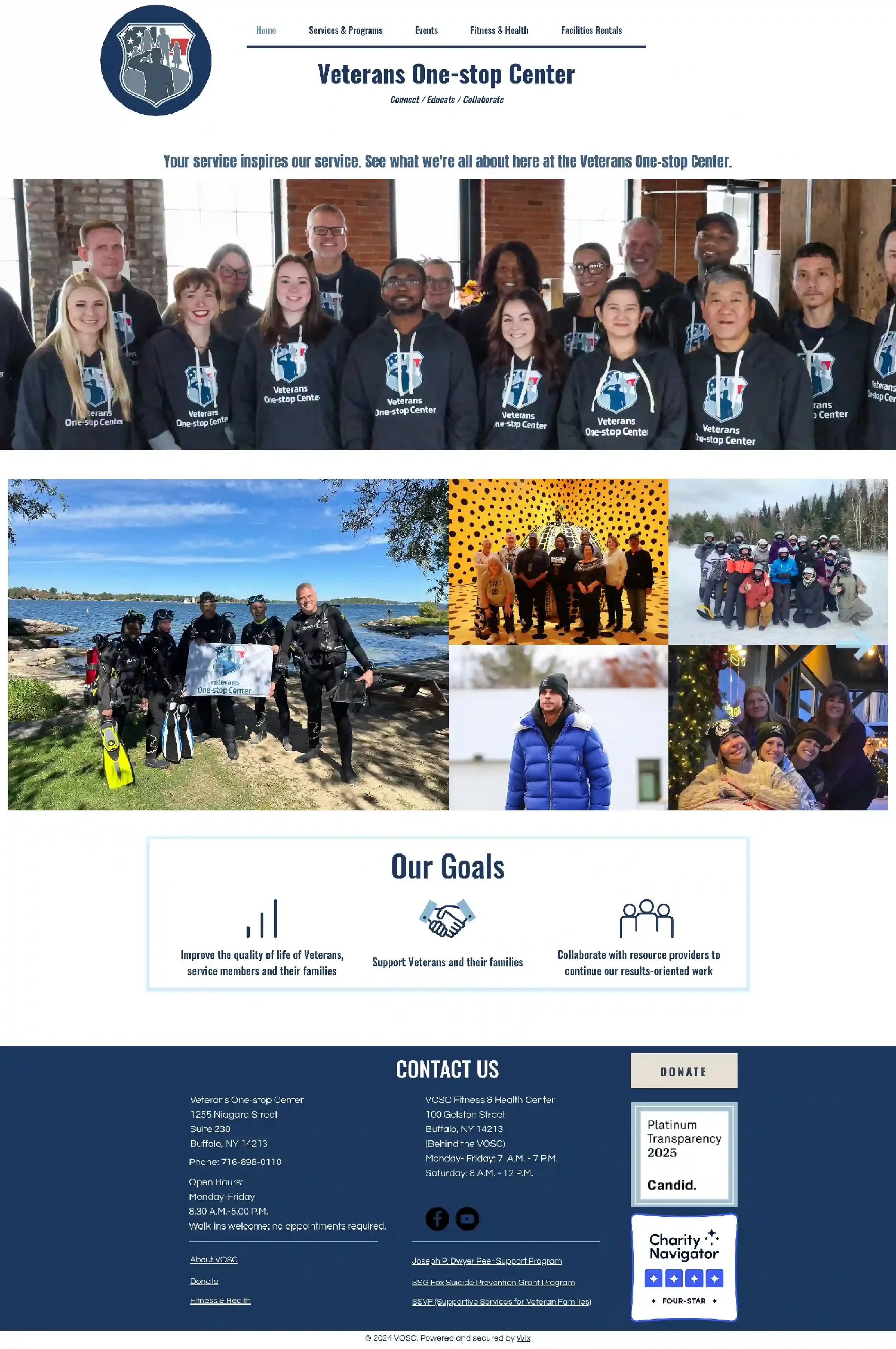
The old website
Built on WIX many years ago, staff found the old website difficult to update. As a result, some of the pages contained outdated information. Over the years, the “look and feel” began to feel boxy and claustrophobic and wasn’t modern or brand-aligned.
From a technical standpoint, the old website had several issues that were making search engines cranky. The color palette didn’t pass contrast checks for accessibility and readability. Font sizes were too small across the board. There was no clear structure to the site—the main navigation was difficult to use and headings and paragraphs were mixed together in a way that made it difficult for search engines to understand the site.
Those sure sound like problems, but I saw opportunities! I knew we could streamline the site’s navigation and make it easier for people to find what they were looking for. And with updated branding to play with, I knew we could fix some of the more technical issues around accessibility and readability. Sprinkle in some new wording and voila—we’d have a shiny new website that connected Veterans to the community they need.
Here’s a look at where we started:
The web design process
When we got started with the project, Heidi connected me with Halie Cardon, the VOSC’s new Content and Engagement Specialist. And Halie came to play!
Not only did she have a full logo suite, color palette, and font files, she had also dialed in the VOSC’s brand voice. She knew exactly how the site should convey its work and mission to Veterans, families, and donors. She had new staff headshots and a ginormous library of events photos—including a fantastic shot of someone grinning from ear-to-ear during a skydive. Gold.
For my clients, working with me is a huge opportunity to rethink how they talk about themselves, their businesses, or their organizations. What better time than a new website project to refresh information, find new ways to illustrate impact, and add the context that prospective clients and search engines both crave?
But the VOSC site is a fairly large one. To make sure rewriting content wouldn’t feel overwhelming, I created a wording outline so they could brain-dump and refine new headlines and paragraphs for the entire site. The wording outline also contained some “free-form” areas where they could plug in the most meaningful statistics and snippets to showcase the impact of their work.
Once we had all of the photos, wording, and third-party code snippets, it was time to play!
I started with a very subdued color palette of white, grey, royal blue, and navy—guaranteed to give the site the contrast it needed to meet accessibility requirements. With that as my foundation, I used their logo mark as a standalone design element and used their vibrant brand red as an accent color on text highlights, section dividers, and more.
From there, the rest of the design fell into place. It includes:
As many photos as I could cram in to make Veterans feel welcome and to show off the vibrancy of the community that VOSC has created;
Clear calls-to-action and plenty of internal linking between pages to help draw visitors into the site and encourage them to explore all that VOSC offers;
An on-site donations widget—no more clicking away to PayPal to support VOSC’s work;
Slanted section dividers as a little call-back to the angle of a person’s arm when they salute—visible in the VOSC logo;
Custom code to provide across-the-board styling for “info rows” around program eligibility, button hovers, and text links
Along the way, Halie gathered a laundry list of things for me so that I could connect the site to the third-party services that VOSC uses to run its day-to-day. The new website integrates with ElfSight to showcase Google reviews in a little pop-up window; links out to their event and registration system through Base44; and links to two different MailChimp signup forms so people can sign up for the general newsletter or the events newsletter.
Take a look at the Veterans One Stop Center’s new website home page!