The Collaborative Center
Imagine giving a student the opportunity to design a solution to a real-world challenge. It’s as energizing and engaging as it sounds—and it’s the mission behind The Collaborative Center for Social Innovation. They’re a Buffalo-based non-profit that empowers youth through experiential learning and social innovation. They provide students with learning opportunities that spark purpose, build confidence, and turn ideas into community impact.
And I am HERE for it.
A friend of mine connected me with Apryle Schneeberger, their executive director. And when I talked with Apryle, it was clear that their website needed a total overhaul. Not only was it a DIY job that didn’t meet modern accessibility standards, it was off-brand and the impact of their work was totally lost in the design.
They needed help sharing their impact and telling a story that would inspire and engage donors.
Done and done.
The old website
A few years back, Apryle built The Collaborative Center’s original website on Squarespace—the platform I love to work on. She bought a domain, set up custom email, and built a pretty extensive site with pages showcasing their mission, their services and programs, and a blog to share student success stories.
But the old website’s design was so busy that the message, the impact, and the story behind The Collaborative Center’s work was lost.
Text was layered over backdrops of eye-bleeding neon and busy, moving backgrounds, making it difficult to read. What little wording there was hadn’t been optimized for search engines. Text-heavy program posters and impact reports had been uploaded as images, making it impossible for the site to properly scale the text for mobile devices and rendering them unreadable.
Perhaps worst of all, there was very little to help visitors navigate the site. The main nav links, which my clients sometimes call the “tabs at the top,” were extremely small and light. There were no buttons on the home page and many of the inside pages, which meant crucial calls-to-action were missing. The site was full of broken widgets, including important forms for donating, contacting staff, and signing up for the Center’s email newsletter.
Here’s a look at where we started:
The web design process
Apryle came to play. She had a logo suite and an extensive color palette. She also had a strong sense of the Center’s voice and how she wanted the site to convey the Center’s work and mission to its parents and donors. And last but not least, she had a deep library of professional-quality photos showing the students in their element.
Logos? Colors? Photos? I love it when projects come with fun toys to play with :)
I knew this website was a huge opportunity for Apryle to rethink how she wanted to talk about the Center. And I knew we could do a much better job of adding the right context in the right places to boost the Center in search results. With that in mind, I created a wording outline so she could update the site’s language and pull in some important statistics to help illustrate impact.
Apryle is by no means afraid of color—there are 13 colors in the brand’s palette. Trouble is, most of those colors don’t pass contrast standards for readability and accessibility on their own, let alone in combination with one another. But that doesn’t mean we can’t find places to use them in the design!
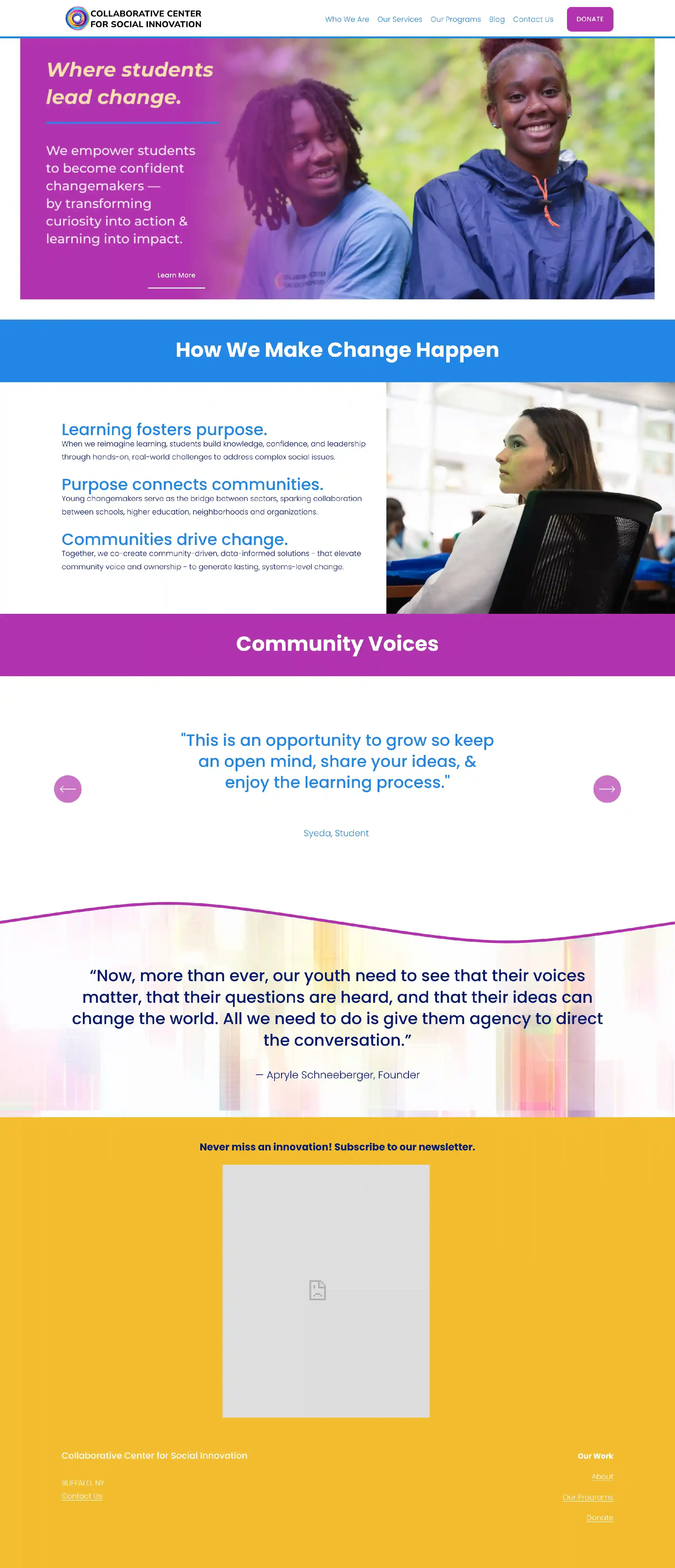
To make the site as accessible and readable as possible, I started with a very subdued color palette that was guaranteed to give the site the contrast it needed. With that as my foundation, I used their logo mark as a standalone design element throughout the site. Then, I added energy by using the brand’s brightest, most vibrant colors as accents. Think stuff like background images, text highlights, section dividers, outlines, supplemental text color, and more.
From there, the rest of the design fell into place. It includes:
As many photos as I could cram in to showcase the beautiful diversity of The Collaborative Center’s students
Clear calls-to-action and plenty of internal linking between pages to help visitors discover more of The Collaborative Center’s story and student success
Embedded GiveButter forms so visitors can donate online, subscribe to the email newsletter, and contact staff
Program registration forms brought over from their old website and redesigned for brand alignment and to meet modern usability standards
Custom code to add fun hover effects to photos, links, and buttons
Take a look at The Collaborative Center’s new website home page!


