O. Deborah Pratt
Deborah Pratt is a consultant and coach who has made it her mission to help people and organizations move forward. But she’s very different from all the other coaches out there—one of many reasons I came to adore her over the course of our project. Deborah knows that true change and sustainable improvement require both a shift in mindset and the discovery of our deep-seated purpose and values. From there, we can identify purposeful solutions and move ahead with what she calls “Strategy with Soul.”
Lest you think it’s all just fluff, let me point out that Deborah’s worked with NASA, the U.S. Department of State, and private and public sector organizations around the world. She’s the real deal.
Hell yes.
Deborah came to me because her website needed a total overhaul. Not only had she rebranded, but her site was a DIY job that needed to be brought up to modern design and accessibility standards.
You know I love working with sharp, talented woman business owners to give them the platform and spotlight they deserve!
Kind words
Deborah recorded a little video to thank me for building her new website. Not gonna lie—it made my entire week! Check it out below:
The old website
Deborah built her original website on Squarespace—the platform I love to work on. She was able to buy a domain, set up a custom email address, and build herself a site with Home, About, and Contact pages. Awesome!
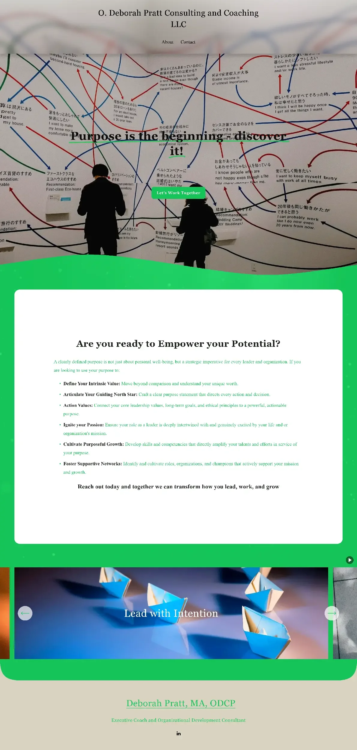
But her old website’s design used stock photos that were off-brand. Text was layered over busy photos, making it all but impossible to read. The neon green and taupe color palette didn’t work and didn’t meet Google’s standards for contrast and readability. Perhaps worst of all, the wording hadn’t been optimized for search engines. Deborah wasn’t coming up in search results, which meant her talent was invisible to anyone looking for a skilled coach and consultant.
Here’s a look at where we started:
The web design process
Before she reached out to me, Deborah had been hard at work to redesign her brand. She chose a gorgeous navy as her main color, then paired it with a gold gradient accent. She whipped up a logo and icon, knew what fonts she liked (and which she very much did NOT like), and had a strong sense of her brand “voice” and how she’d like to come across.
Absolute GOLD.
I knew Deborah wanted a longer home page that would showcase not only her services but give visitors a sense of her unique process. Along with that, she was hoping for her site to include Services, About, and Contact pages, in addition to a page that folks could use to schedule an initial discovery call.
I created a wording outline so Deborah could pencil in her thoughts. It was a huge opportunity—not only to rethink how she wanted to talk about her business, but to give Google the context that it loves. I also gave Deborah a list of websites where she could download some free, high-quality stock images to round out her site.
Deborah isn’t afraid of color, but knew she wanted a site that was clean and fresh. It had to also be purposeful and to the point. There were to be no frills, no frou-frou, and absolutely no crossed-arm photos. She knew she wanted Garamond as her headline font and positively did not want Arial to come within ten feet of her paragraph font.
Done and done!
Garamond is an elegant, timeless font that’s based on a font created in the 16th century. Paired with the wrong font, it can feel a little stuffy and old school. To keep Deborah’s site modern, I paired it with Lato, a sans-serif font that’s prized for its readability. Lato means “summer” in Polish, and the font feels fresh and approachable. Perfect.
Deborah’s new brand is simple. But I always say that a simple brand doesn’t have to mean a boring brand. Her new logo includes a fabulous person icon that felt very optimistic and energetic to me. I pulled it out of her logo and used it as a standalone element throughout her site, along with a golden gradient line that pairs nicely with the golden swoosh in her logo.
From there, the rest of the design fell into place. I pulled her site’s blue and navy right out of her logo, then paired them with a lovely taupe and an off-white to make the site feel calm, serene, and friendly. Along the way, I paired a few full-bleed background photos with a dramatic color wash to keep the site interesting.
And you know I couldn’t resist the opportunity to zhuzh things up with some custom code. I love me some hover effects, especially in the main menu and on the buttons :)
Take a look at Deborah’s new website home page!


