Danielle Prester
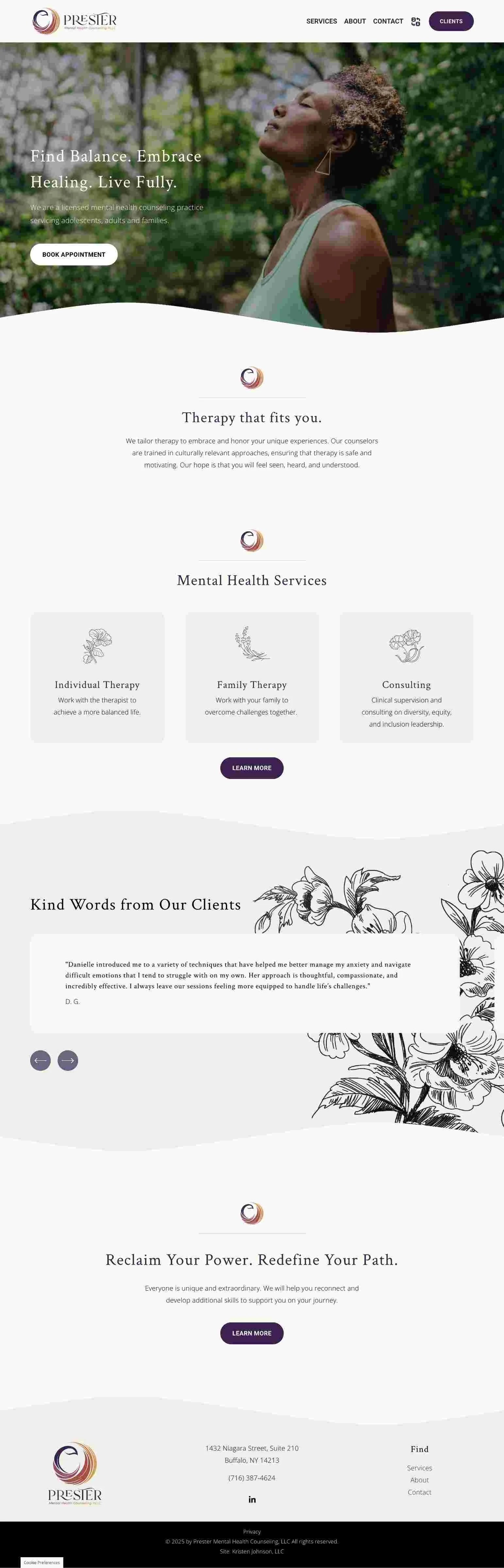
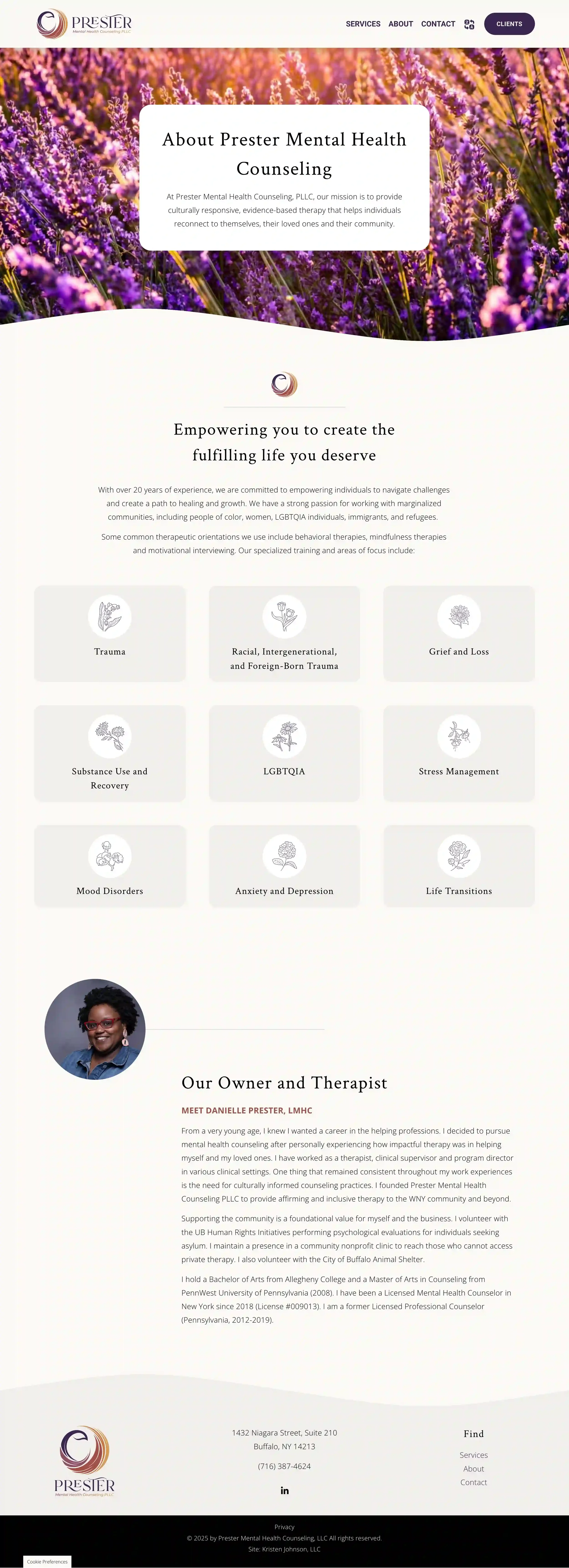
Danielle Prester is the talent behind Prester Mental Health Counseling, a licensed mental health counseling practice serving adolescents, adults and families throughout Buffalo and Erie County.
When Danielle came to me, it was with a request to create a website for her new practice. She’d been getting by with her Psychology Today profile, but was ready to flesh it out into a website that would offer more information about her services and her approach to therapy. Most importantly, she needed her website to set prospective clients at ease.
Done and done. I absolutely love giving women business owners the website they deserve!
Kind words
“I LOVE IT!!! My website is so clean and professional, but also really warm and inviting. You are AMAZING!!!!”
Danielle Prester, Owner
Prester Mental Health Counseling, PLLC
The web design process
Danielle came to play. She already had a professionally designed brand, including a logo, colors, and fonts. Her logo has a bold mark that would help her stand out, and her brand color palette is full of warm, autumnal colors like rust, orange, yellow, and purple.
She didn’t have many photos to work with, so I connected her to some sites she could use to download free, high-quality stock images. She was also able to find a few high-quality photos of herself, including a headshot full of personality.
To help Danielle turn her Psychology Today profile into a full-fledged website, I created a wording outline to help her talk about her services.
Danielle’s vibe? Airy and uncluttered, warm and inviting. She wanted plenty of white space to let the eye rest and some floral touches here and there to bring in her personality.
Whoa nelly, did someone say “floral”? I’m an avid gardener, so this was right up my alley! Here’s a look at a couple of the design elements I used on Danielle’s website:
I used her brand’s bold mark as an icon to bring in a pop of color here and there. It was a great way to keep the site brand-aligned while adding color to the design.
I found some fabulous, hand-drawn icons featuring various floral arrangements. Best of all, they were free. Perfect! I grabbed all of them, then created different versions using a few of her brand colors. The result? A palette of brand-aligned icons she can use on her website, social media, and in printed rack cards for physician offices.
To round out the design, I added some floating line elements, offset text, and a gentle cream-and-beige color palette to anchor her brand’s bold colors. Last but not least, I sprinkled in some custom code to add some subtle button hover effects.
One big part of making Danielle’s website inviting was offering language translation. Because third-party language translation services get expensive fast, I linked her site to the free Google Translate service. Visitors can choose to have Danielle’s site translated into any language on the planet in just a couple of clicks. Meeting people where they are? Gold.
Take a look at Danielle’s new website!