Jen Getty
Jen Getty is the talent behind Zinnia Transaction Coordination, where she manages all of the minutiae of real estate sales for Real Estate Agents throughout Western New York. Jen’s one of those fabulously upbeat people who makes you smile the minute you meet her. And she’s hyper organized and wonderfully conscientious, making her the perfect person to keep the trains running on time.
When Jen came to me, it was because her old website wasn’t working for her any longer. The once-great design now felt cluttered and off-brand. It didn’t convey information about her services as clearly as it could have. And what’s worse, her old website didn’t pass WCAG checks for accessibility and readability, lowering her position in Google search results.
A new website was in order. What a pleasure it was to work with Jen and give her the website she deserves!
Kind words
“Kristen was amazing to work with! Her energy is contagious. Our initial meeting was super thorough and detail oriented about all of the things we would do and what she would need. She recapped our meeting with an email and everything was laid out so well to understand. It was well thought out and did I mention how convenient the website editing was?! That was amazing too. The website review process was sent over in an email and so easy to navigate and I loved how efficiently you could write comments where needed for any edits. Her responsiveness was done in a timely manner as well. Highly recommend! You won't be disappointed—you'll be extremely pleased!”
Jen Getty, Owner
Zinnia Transaction Coordination
The old website
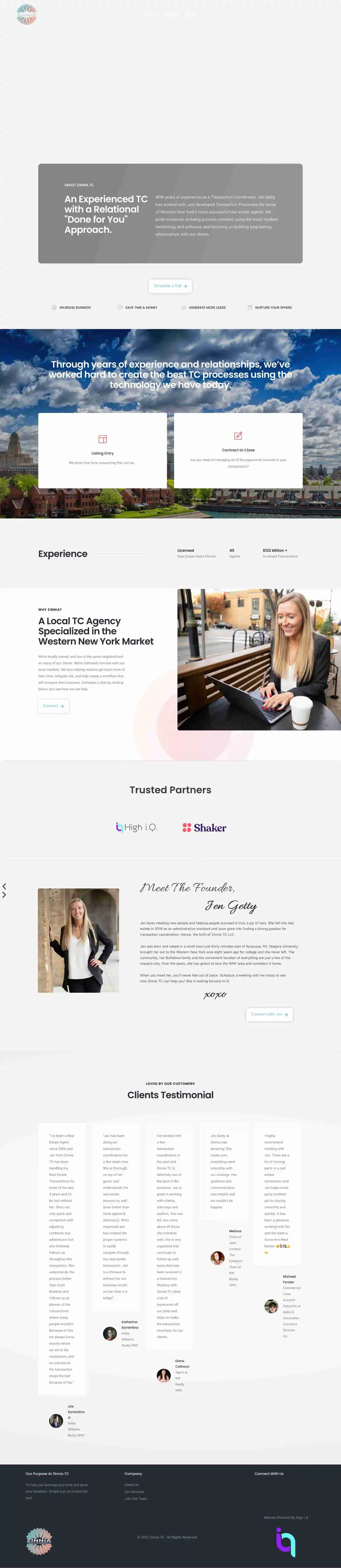
Jen’s old website was built on WordPress, making it really hard for her to update and maintain. Yikes! Here’s a look at her old website homepage. You can see some images that aren’t loading and text that’s hard to read.
The web design process
Jen already had professionally designed brand elements, including a logo, fonts, and colors. She also had a ton of great photos from a recent photo shoot. Glorious!
Pretty websites are great and all, but if they’re hard to understand? It’s all for nothing. Website wording should be concise and clear, with obvious calls-to-action for visitors to click. The wording should “flow” in such a way that visitors can see a clear path to becoming buyers. That was one area where Jen’s current website was struggling, so I created a wording outline for her.
Jen wanted an ultra minimalist site with a very clean, bright, fresh aesthetic. Check!
I kept the site white and fresh, adding in a light grey for a bit of contrast and using her brand teal as a pop color. To keep the site brand-aligned with a bit of extra fun, I took the flower from her logo and turned it into a colorful accent icon that I sprinkled throughout the site. Last but not least, I added some custom code to create fun button hover effects and a few other bells-and-whistles.
Most importantly, I was able to solve Jen’s biggest problem. Squarespace is much easier to update than WordPress. No more reaching out to a developer, waiting for a response, and having to pay for updates! Touching her old website was terrifying because she didn’t know exactly how it all worked with her domain name and custom email address. Not only was I able to help her figure it all out, I also helped her get her domain name transferred to her very own GoDaddy account. Last but not least, her custom training video makes it clear exactly what’s what so she’s set up for future success.
Glorious, right? I believe everyone should be able to update their own website. It saves a ton of time and money—and means you can confidently take full ownership of your most important piece of marketing collateral.
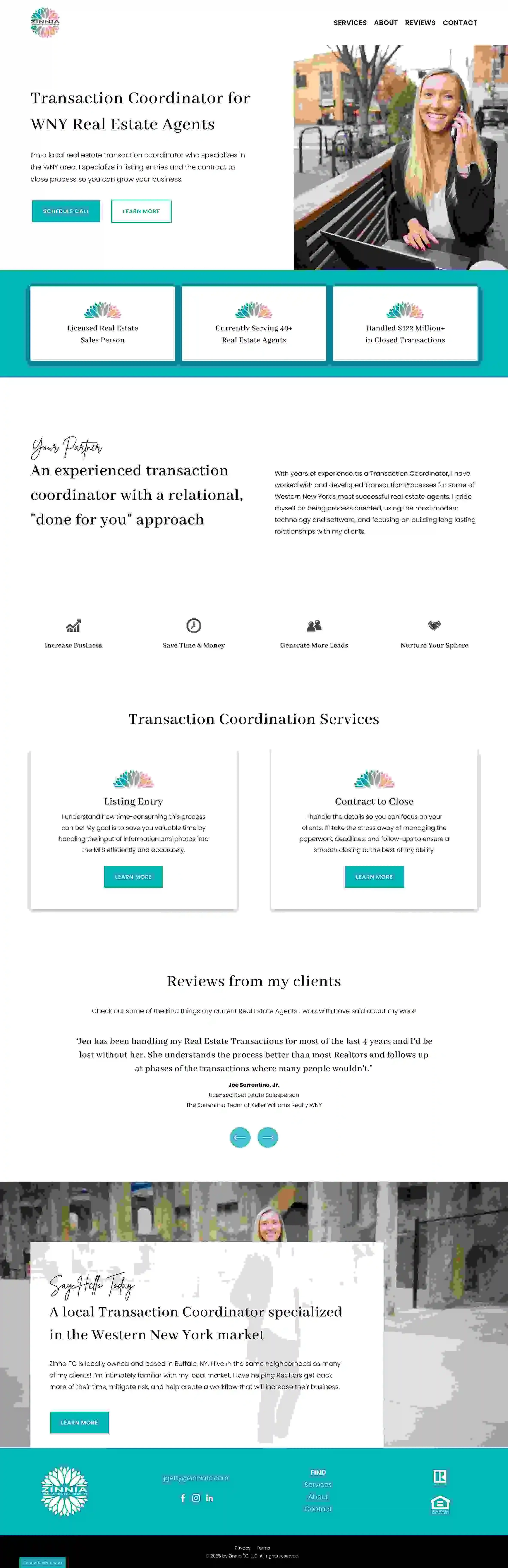
Take a look at Jen’s new website home page!