Mike Cosgrove
Mike Cosgrove is the talent behind American Contract Cutting, which provides precision automated cutting for industrial textiles and composites. Working with Mike means manufacturers get scalable automated cutting services without the cost and complexity of purchasing equipment, hiring operators, or dedicating valuable floor space. Doing this in a time when domestic manufacturers are struggling? Gold.
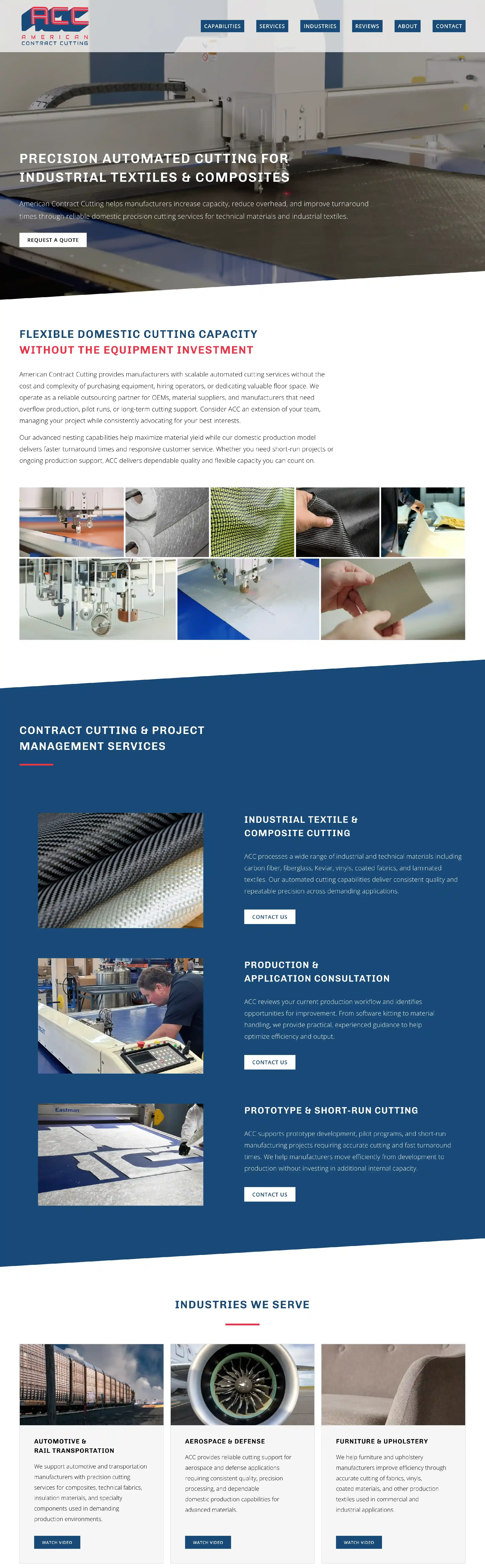
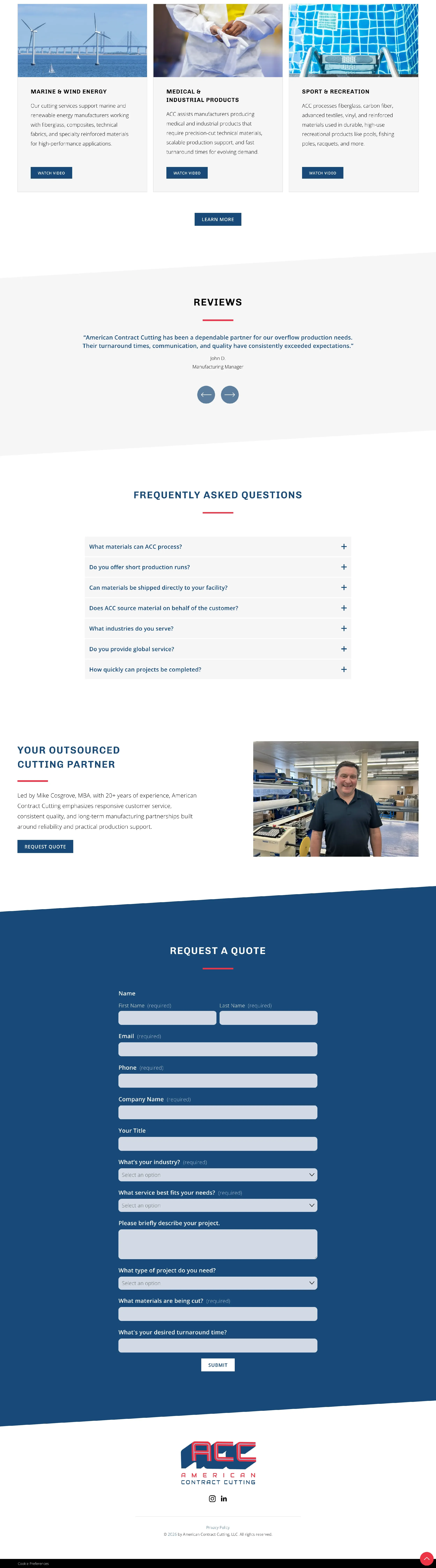
When Mike came to me, it was because he needed a website. Desperately, in his words. He wanted an ultra-simple, one-page website that would showcase his capabilities, list his services and the industries he serves, and provide a contact form so folks could reach out.
Done and done :) It was a lot of fun to give Mike’s expertise the platform it deserves!
The web design process
I got to work with Mike’s marketing consultant, Lydia, on this project. She knocked it out of the park!
Mike already had a professionally designed logo and a color palette. I set them up with a wording outline so she and Mike could envision how the site would come together and write out what he wanted it to say. He and Lydia stopped by a few of my favorite stock photo websites and downloaded a handful of free options to use on the site. To top it all off, Lydia was able to take some great photos of Mike working with equipment at the factory. Love it!
I took it from there! Mike’s brand color palette includes a vibrant red and blue. I rounded it out with a light silver as a background color offering a bit of gentle contrast. From there, I found a headline font that matched Mike’s logo and used my beloved Open Sans for the paragraphs and button text. We later changed the headline font to Chivo, a solid but balanced sans-serif that looks fabulous when boldfaced.
Mike wanted a simple site with a simple, clean look. Simple, simple, simple. Done! I used navy blue to highlight the most important parts of the site—the services and contact sections. Everything else was done in a light, airy combo of the white and silver, with plenty of colorful photos to spice it up. I used his brand red as an accent on button hovers and thick lines to highlight headings.
Once I had the site built, it was time to think about navigation. It’s a unique struggle with one-page websites! Because they’re just one page, they tend to be a longer scroll. While social media has conditioned people to accept scrolling, it’s a real a turn-off to have to scroll for a long time before finding the answer you need.
With that in mind, I added a dash of custom code to create a simple navigation with subtle, classy hover effects. Visitors can click or tap a tab and the site will gently scroll them right to the info they’re looking for. When they get there, a subtle button will be waiting in the corner to take them back to the top of the website. It works beautifully on mobile devices, too. Glorious.
Take a look at Mikes new website! I split it into two screenshots since it was so long :)