Santora’s Pizzeria
The only thing better than working with awesome people is working with awesome people twice.
Santora’s Pizzeria is Buffalo’s original pizzeria. In 1927, Santora’s Pizzeria Napolitano opened as Buffalo’s first pizzeria and became an instant success.
I recently had the pleasure of working with Marc DiGiore, their Chief Marketing Officer, on the new Picasso’s Pizza website. So when he popped into my inbox again to see if I could build them a new site for Santora’s, I was game. I love giving local businesses the website they deserve!
Their old website
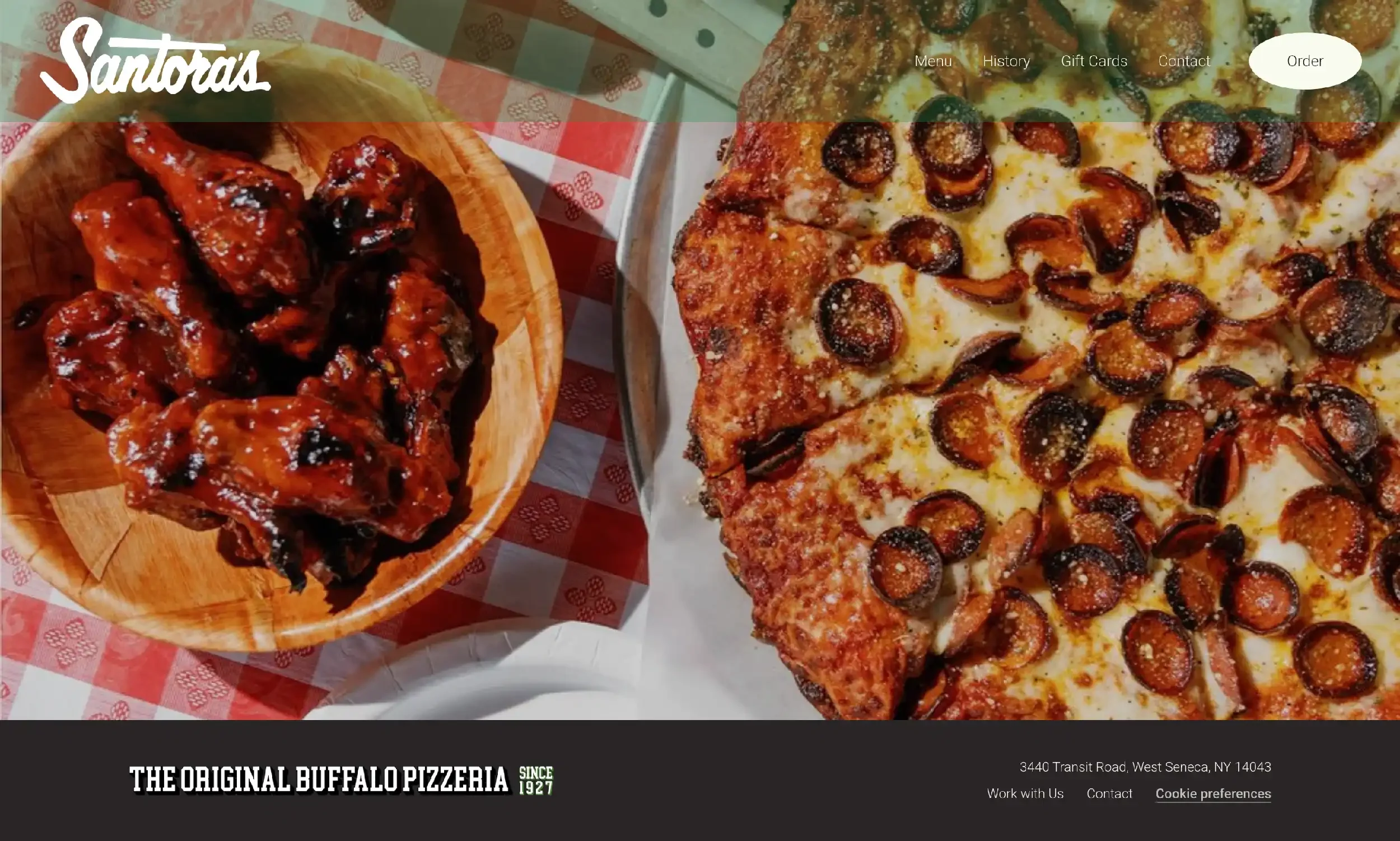
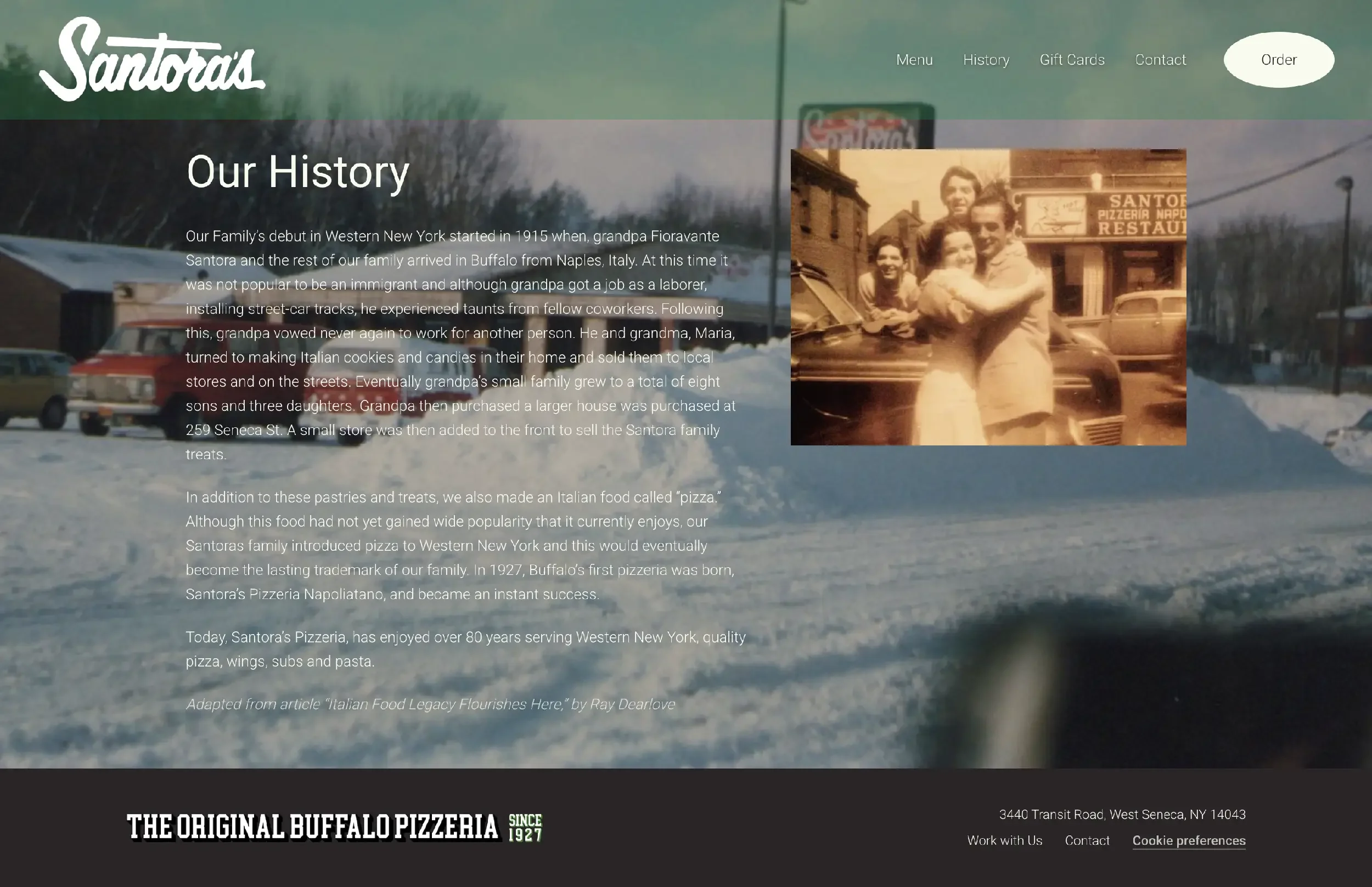
Santora’s used Squarespace to create their original website. It was hard on the eyes, though! The design relied heavily on a kelly green and busy, edge-to-edge background images with text layered over them. The combination made the site really difficult to read and took the focus off of the pizza and the company’s history. The tabs at the top were simple and streamlined, but it wasn’t clear where visitors could go to order online.
To give you an idea of where we started, here’s a look at their original website home page and history page:
The web design process
There was an embarrassment of riches awaiting me for the Santora’s website.
Marc hooked me up with Zach Pape, their Creative Director, who loaded our project folder with all sorts of goodies. High-res logo files, font selections, color palette info, fabulous brand photography from the talented Bridget Schaefer, and an actual ton of historic photos from the family’s archives.
To round it all out, Marc rewrote the website from top-to-bottom, filling out the wording outline I created in short order.
You know I love it when clients give me lots of awesome toys to play with!
Marc and Zach wanted the site to speak to Santora’s history and its standing as Buffalo’s original pizzeria. I tinkered with their brand red and green, but struck gold when I saw their menu design. The menu has a slightly retro look with cursive font, cute illustrations, a beige background, and curved red lines.
I leaned into it! Zach provided the cursive font, and I pulled the beige color code straight off their menu. Paired with black text, it became the foundation for a design that leveraged their brand red as an accent color and their brand green as the background color for some subheading call-outs. The new History page includes a lovely gallery of photos from the family archives—probably my favorite part of the new design.
To top it all off, I sprinkled in some fun site dividers and subtle animations. For extra oomph, I coded in the same button effect that I used on the Picasso’s website—just with a different button shape. It helps the sites speak to each other while remaining unique and standing on their own.
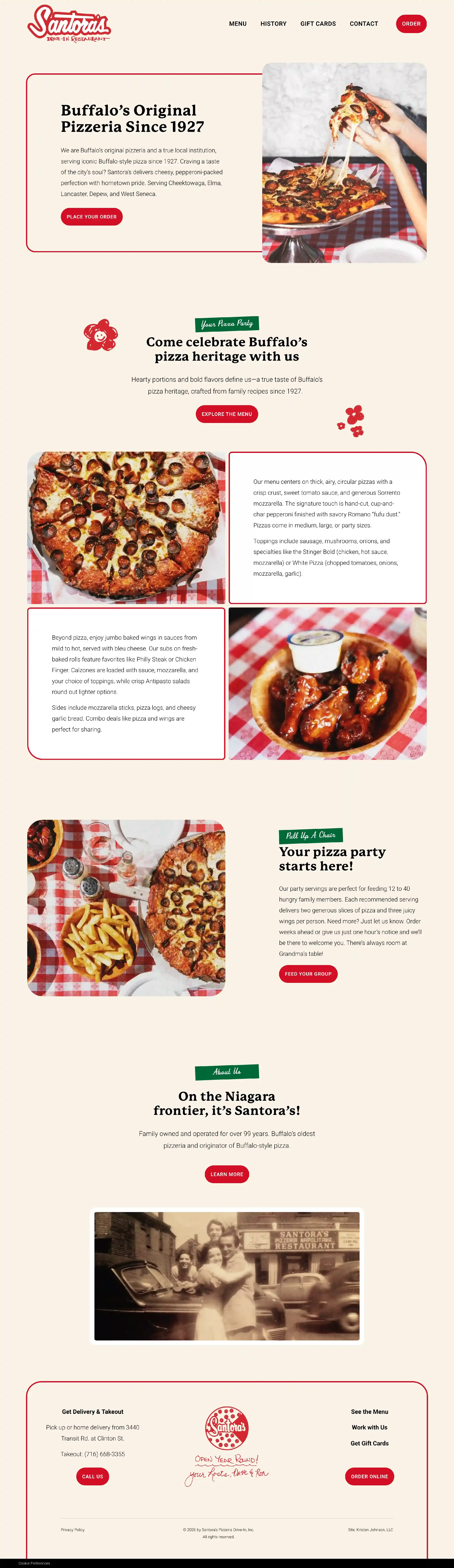
Take a look at Santora’s new website home page!