Chautauqua Grants
One of my favorite things about building websites for non-profits is that I get to give them a platform that amplifies their important work and that helps them do good for even more people. Imagine my delight, then, when I got to build a website for a non-profit that works to help other non-profits!
Chautauqua Grants is a one-stop shop for non-profits in Chautauqua County, New York. Their work makes it simple for local non-profits to apply for grant dollars from a dozen local funders. They also connect local non-profits to regional, state, and federal resources.
But their work doesn’t stop there! They go the extra mile and connect these local non-profits with The Capacity Lab, a collective impact initiative designed to strengthen the Chautauqua County nonprofit sector by providing access to resources, tools, best practices, training, and professional development opportunities.
Making this project extra rewarding? I’ve had the pleasure of designing new websites for both the Chautauqua Region Community Foundation (CRCF) and The Capacity Lab.
So when the fantastic team at CRCF reached out to see if I could help them reimagine the Chautauqua Grants website, it made me feel like a million bucks—and I was happy to leap right in.
The original website
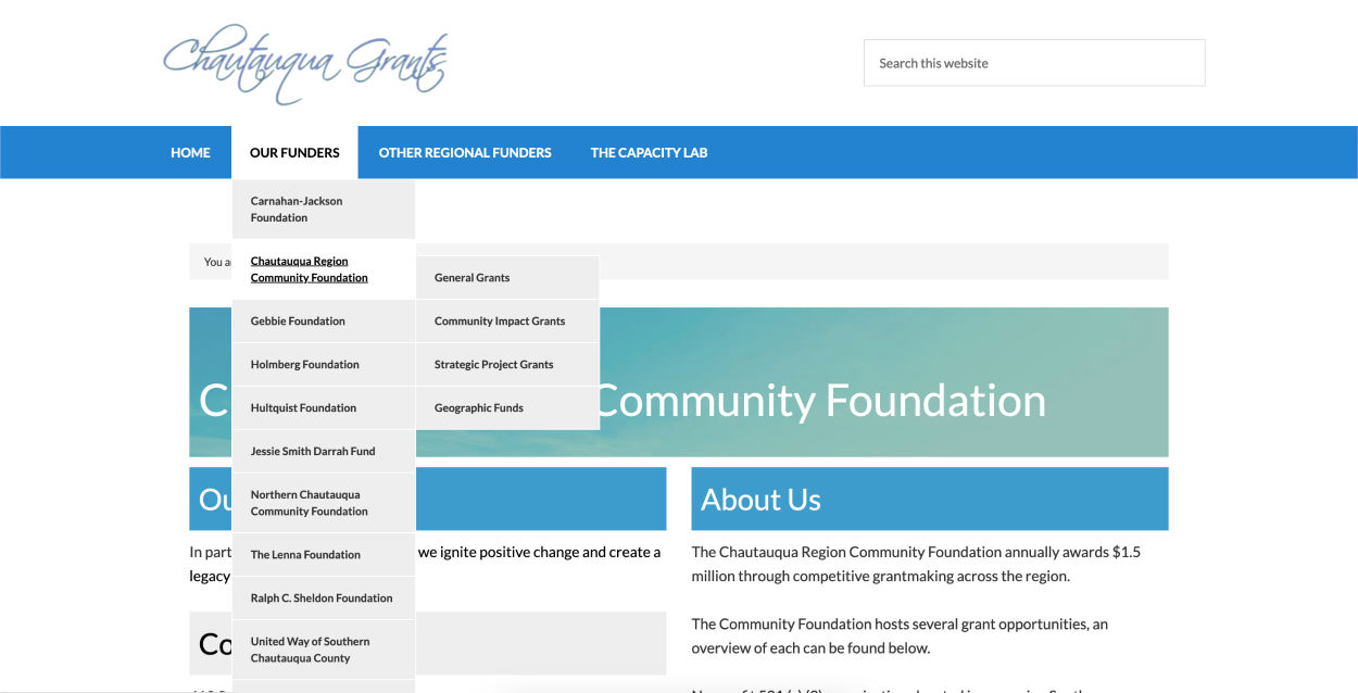
Chautauqua Grants already had a website. But like the original website for CRCF, it had been built on WordPress “back in the day,” which meant it was old, difficult to maintain, and sported the dreaded “boxes within boxes” layout.
The existing site was difficult for members of the public to navigate, too—there was an absolute ton of text, super long drop-down menus with multiple levels of flyout menus, and no clear calls-to-action.
To give you an idea of where we started, here’s a look at one of the original pages on the site. The drop-down menu was so long that it didn’t fit “above the fold.” And you might not realize it because they don’t read as links, but the headlines on this page are clickable.
The web design process
The Chautauqua Grants team knew the website needed a total overhaul—and not only to make the logo easier to read and better aligned with that of their parent organization.
One of the best parts about Chautauqua Grants is the “one-stop shop” that they’ve created. Local non-profits seeking funding need only fill out a single application, housed within a separate website.
Sounds simple, right? Well, not so fast. One big reason that the original Chautauqua Grants website was hard to navigate was that it duplicated most of the information already available to applicants on the application portal. The website was carrying weight that it didn’t need to carry. Not only did that make it harder for applicants to get the information they needed, it made it harder for them to find that information at the specific point in the process where it was most relevant.
With my wording outline in hand, the Chautauqua Grants team combed through their existing website and application portal to consolidate information and simplify it as much as possible. While they were working on that, my job was to come up with a plan for creating clear user pathways through the site so that applicants knew where to go to apply for funding or manage a previously awarded grant.
Once we had all of the content finalized and ready to go, it was time for design. Here’s a quick glimpse of how the website design came together:
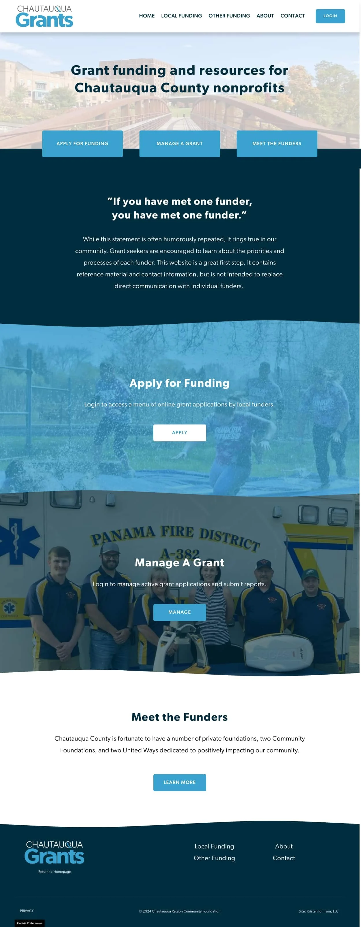
I kept the design ultra-simple and made sure clear calls-to-action were front-and-center so that applicants could easily apply for funding, manage a grant, or learn more about the local funders. Many of those calls-to-action were connections to Grant Interface, the organization’s online application portal. And they solved one of the existing website’s biggest problems: Grant applicants weren’t sure where to click or how to log in to access the one-stop application.
I leveraged the Chautauqua Grants brand to create a website full of blues and wavy section dividers intended to strengthen the connection to Chautauqua Lake, which features prominently in the new Chautauqua Grants logo.
I reimagined the layout of the “Other Resources” page. Previously a wall of text that took almost a full 30 seconds to scroll through, the new page is ultra short, simple, and features clear headings to help applicants quickly find local, regional, state, and federal funding resources.
Whew! I’m so pleased with how it all came together. Check out their new home page design below! When viewed on a mobile device—as so many applicants do—the new home page feels like an app. Love it!