Chautauqua Region Community Foundation
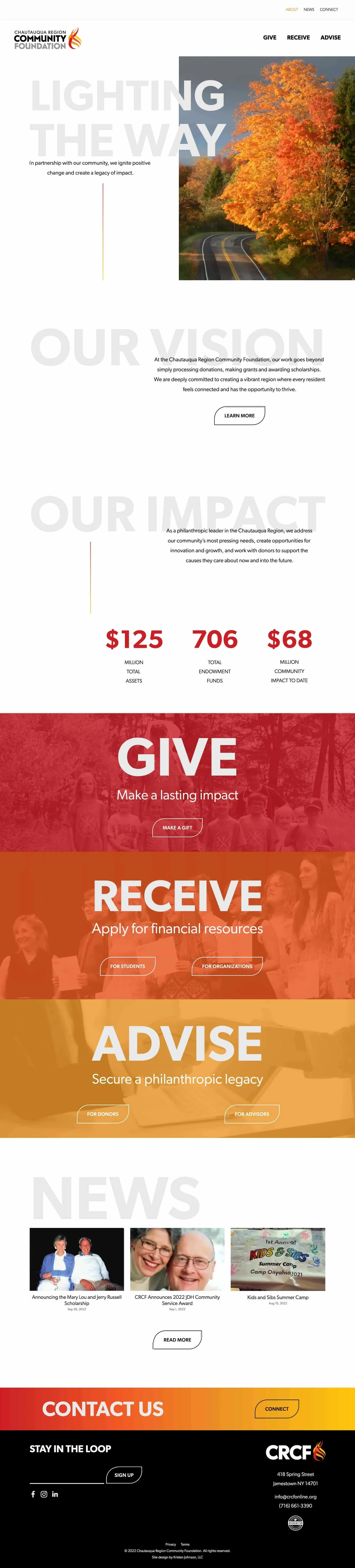
The Chautauqua Region Community Foundation is a philanthropic leader in Chautauqua County. Their work goes beyond simply processing donations, making grants and awarding scholarships. They are deeply committed to creating a vibrant region where every resident feels connected and has the opportunity to thrive.
Following a rebrand, the Foundation found itself desperately in need of a new website—starting with a complete reimagination of the role it would play in connecting donors and recipients to the Foundation’s work.
Done and done. What a pleasure it was to give them the web presence they deserve!
The original website
The Foundation’s original website had been designed on WordPress “back in the day”—it was so old that nobody on staff knew exactly when it had been built and launched. And because it was old, the design was an outdated “boxes within boxes” layout and the website had, over time, become bloated with extraneous pages. There were mountains of text and no clear calls-to-action, making it difficult for members of the community to find the information they needed.
To give you an idea of where we started, here’s a look at the former Scholarships page:

The web design process
To launch their web design project, I scheduled a couple of meetings with the Foundation’s staff to get a sense of what they didn’t like about their existing website and learn about the features they wanted on a new site. One of their most important requests: Clear calls-to-action throughout the site that would make it easy for donors and recipients to find the information that mattered most to them.
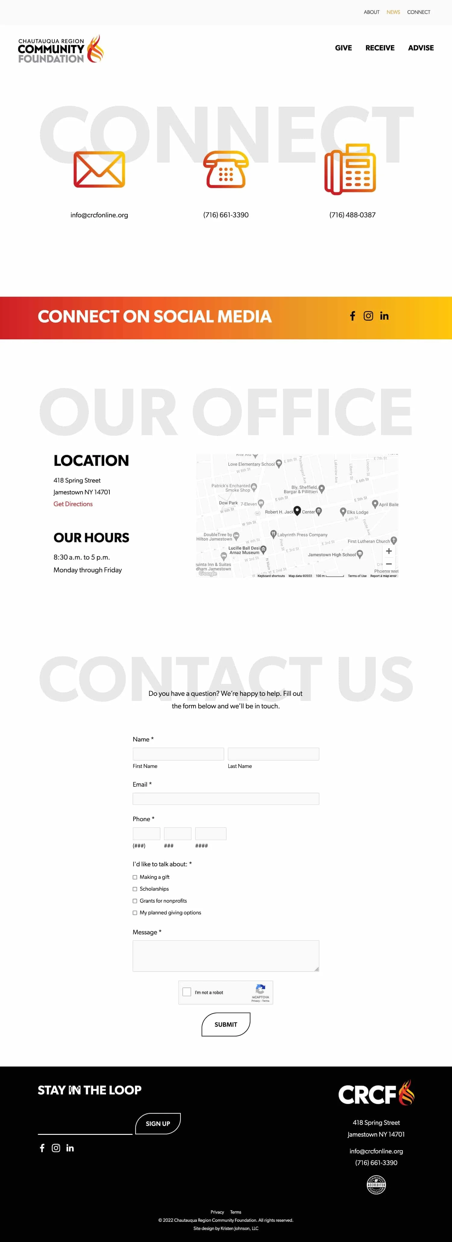
We also talked through a new sitemap and what the page structure might look like. Knowing they wanted clear calls-to-action, I recommended dividing pages into donor groups: Give for donors, Receive for scholarship and grant recipients, and Advise for planned giving and professional fund advisers. They liked the idea—and with their approval, I created a wording outline so they could prepare new content for each page on their website.
I knew Squarespace would be the perfect home for the Foundation’s new website. Like so many of my clients, they aren’t “tech people.” They had always struggled to update their WordPress website and found it difficult to make even the simplest change. To make matters worse, the Foundation had recently rebranded, yet they were unable to leverage their old website to champion the new brand identity.
I wanted to put their website on Squarespace because it “just works” and I knew it wouldn’t be a distraction. I wanted them to be able to focus on the work that matters! What’s more, Squarespace’s ease-of-use would make it easy for them to dip in and make updates.
The Foundation’s new brand is incredibly bold, but spare. It uses four colors—red, red-orange, orange, and yellow—along with black and white to create a brand that’s as vibrant and essential as the Foundation’s work. I wanted to bring a minimalist look to their new site so the boldness of the brand wouldn’t be overwhelming. I had a lot of fun with gradients and button hovers! The result is a web design that’s bright, fresh, and airy, anchored by bold touches of color.
Here’s a glimpse of the new design: